Case study
Broadgate Capital
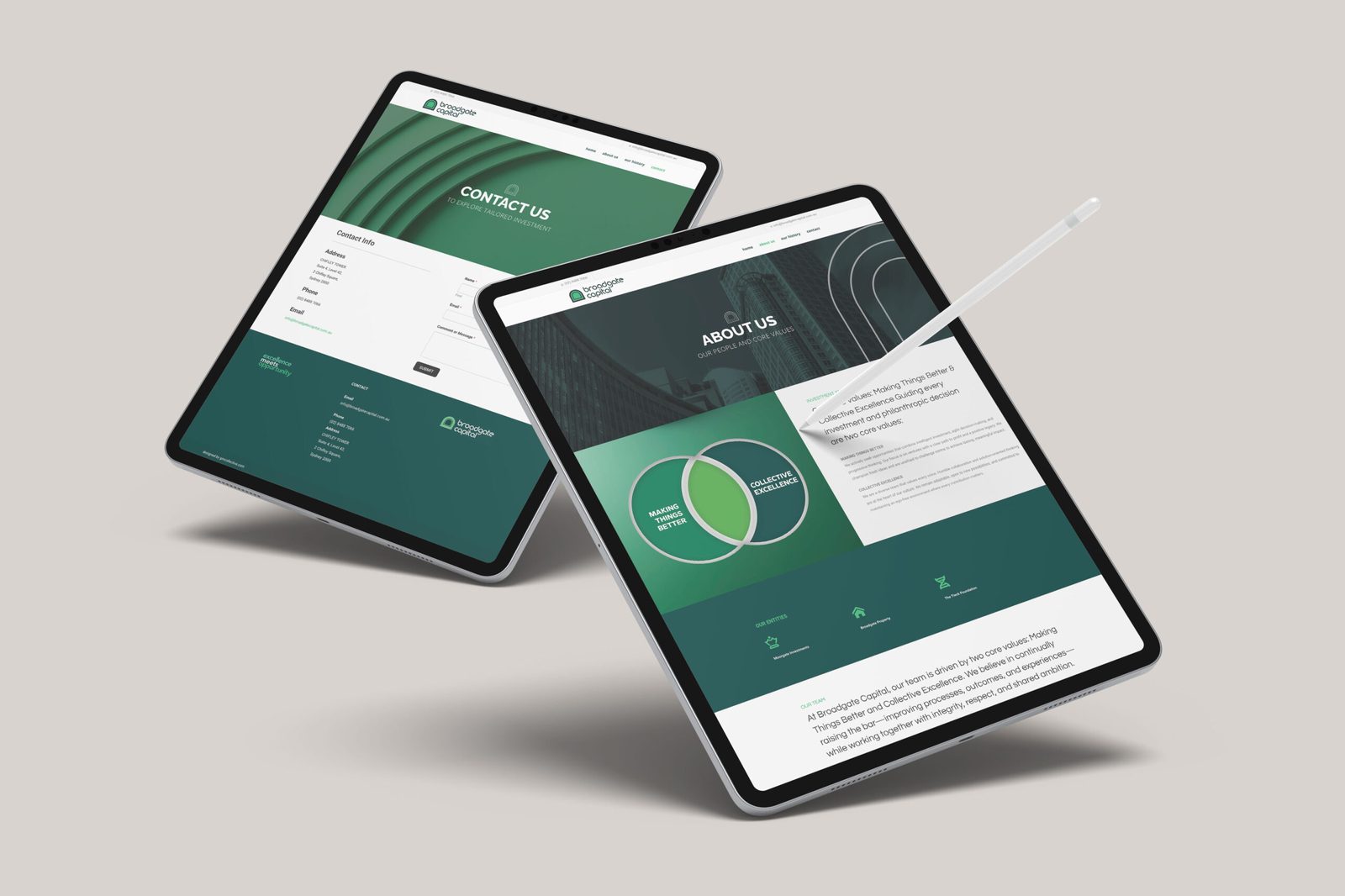
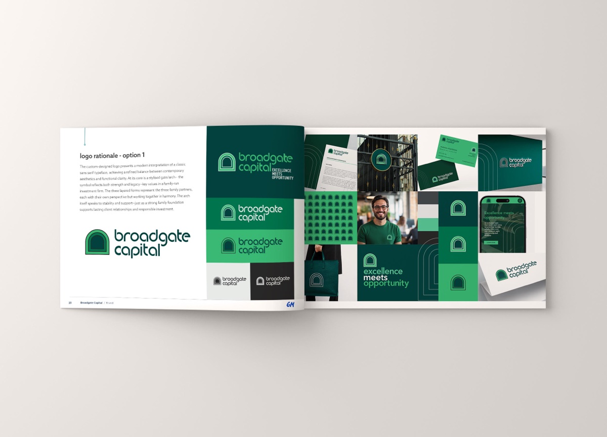
Brand identity for a family investment business, built around an arch motif — a gateway signalling strength and forward passage — carried from the logo through to office signage.
Broadgate Capital — Family Investment Business
Brand Identity, Digital, Content Design
2025
The brief
Excellence meets opportunity.
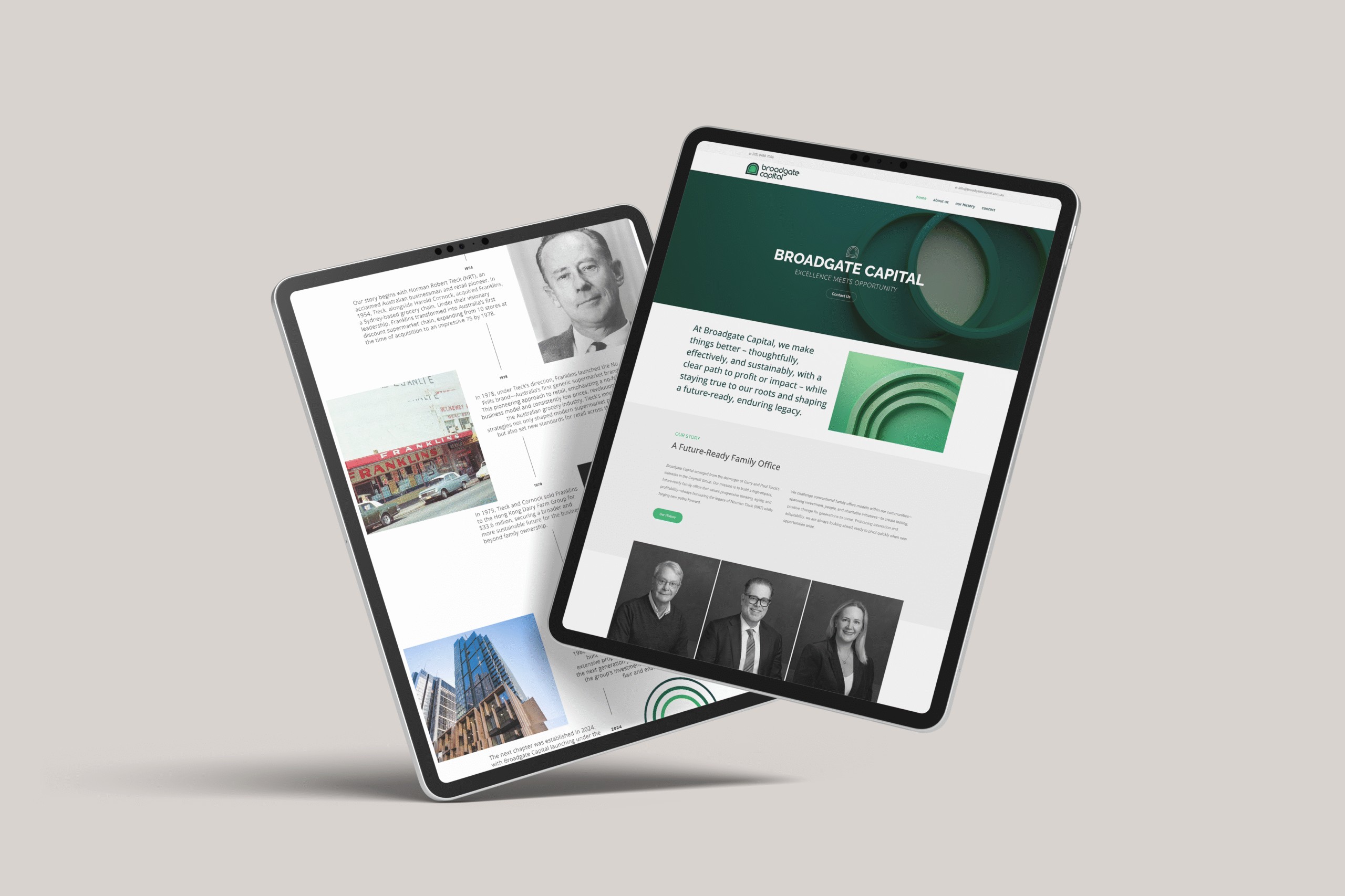
Broadgate’s story runs through a family tradition of enterprise — the Tieck family previously built Franklins supermarkets, launching Australia’s first generic supermarket range. That same instinct for innovation and long-term thinking carries straight into Broadgate Capital’s identity today.
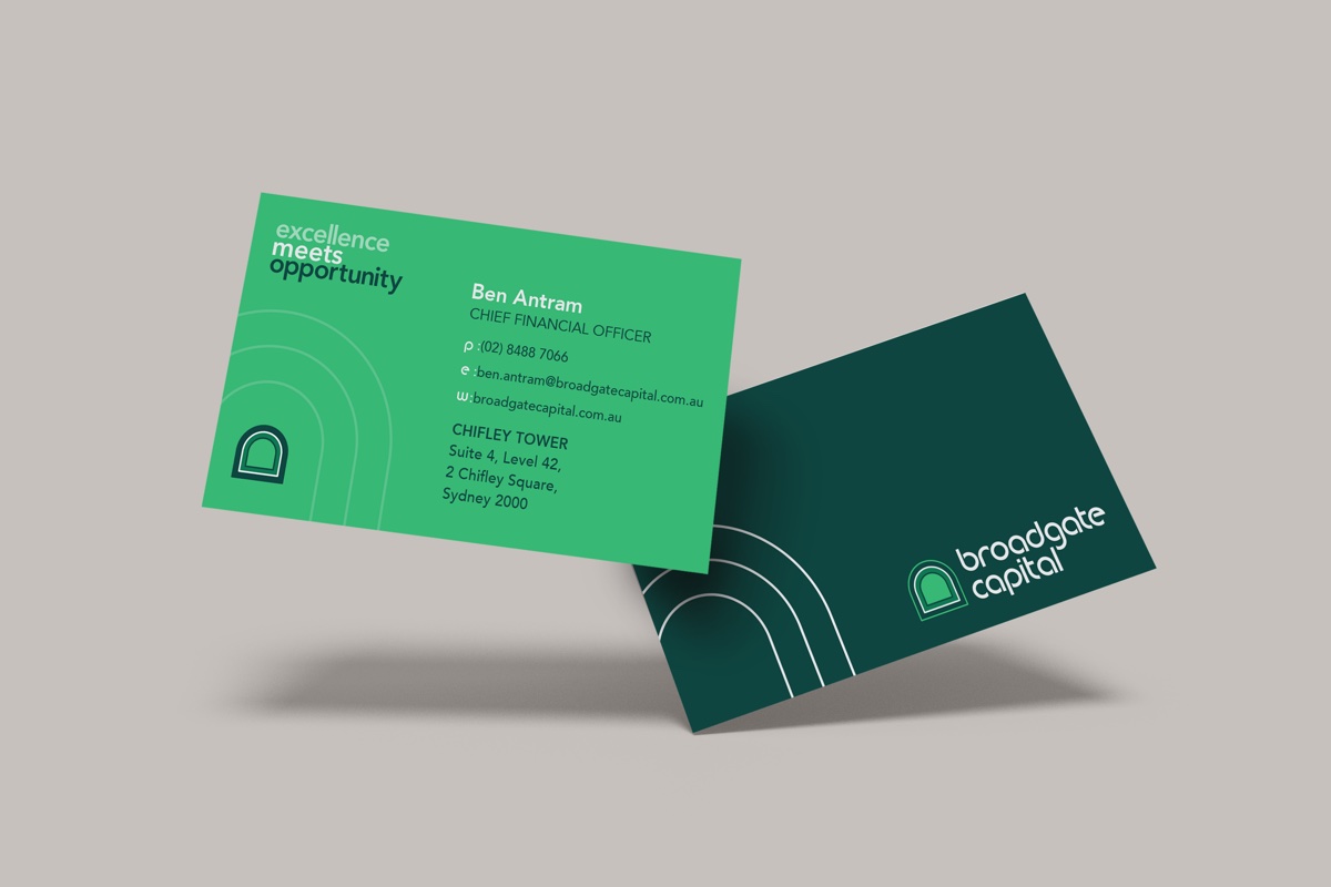
I built the revised logo on a “rule of three” — three elements uniting into one memorable mark, a quiet nod to the firm’s three partners. The arch motif drawn from that mark became a flexible device I carried across the website, marketing collateral, office interiors and signage, so the identity reinforces the same values wherever it shows up.
The work